04 Nov How Much Water to Use in Watercolor: The Easy Tea-to-Butter Guide
Pale colors, streaky patches, a puddle sitting on your paper – almost every beginner problem starts with one question: how much water to use in watercolor? Good news: you don’t need to measure anything. After more than 10 years of painting, I rely on a simple kitchen scale and my own eyes. This guide shows you how to see and feel the right amount of water – plus a free practice sheet you can print.
Level 1 · 10-min practice · 4-min read
This post contains affiliate links. As an Amazon Associate I earn from qualifying purchases.
Quick Answer
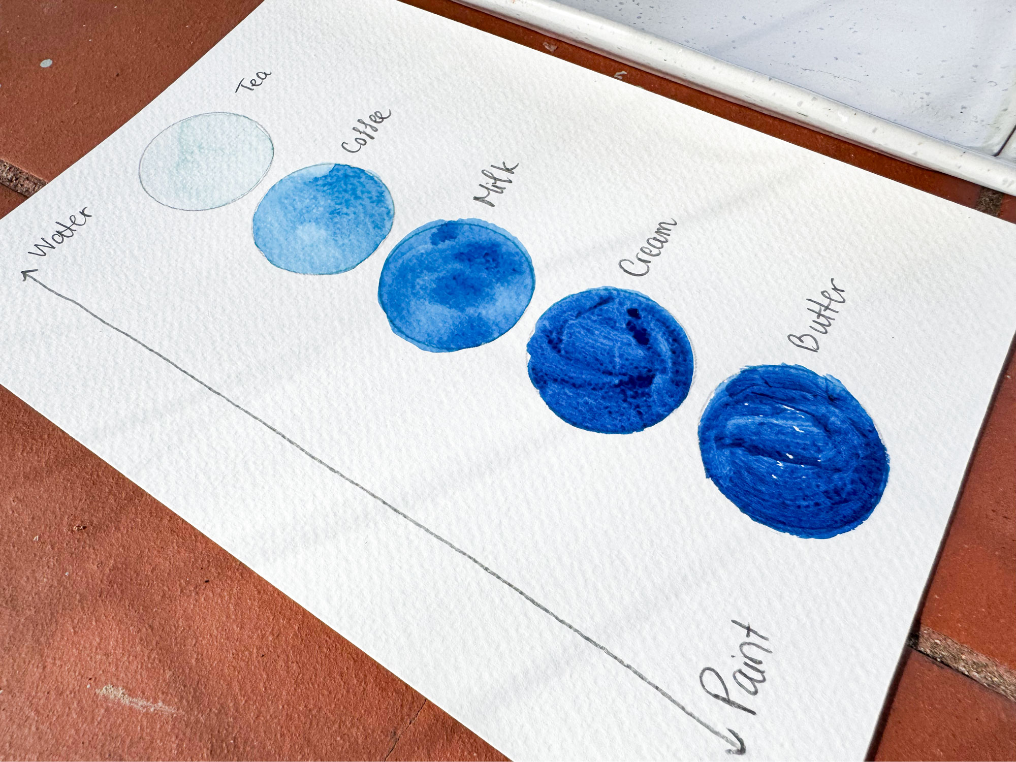
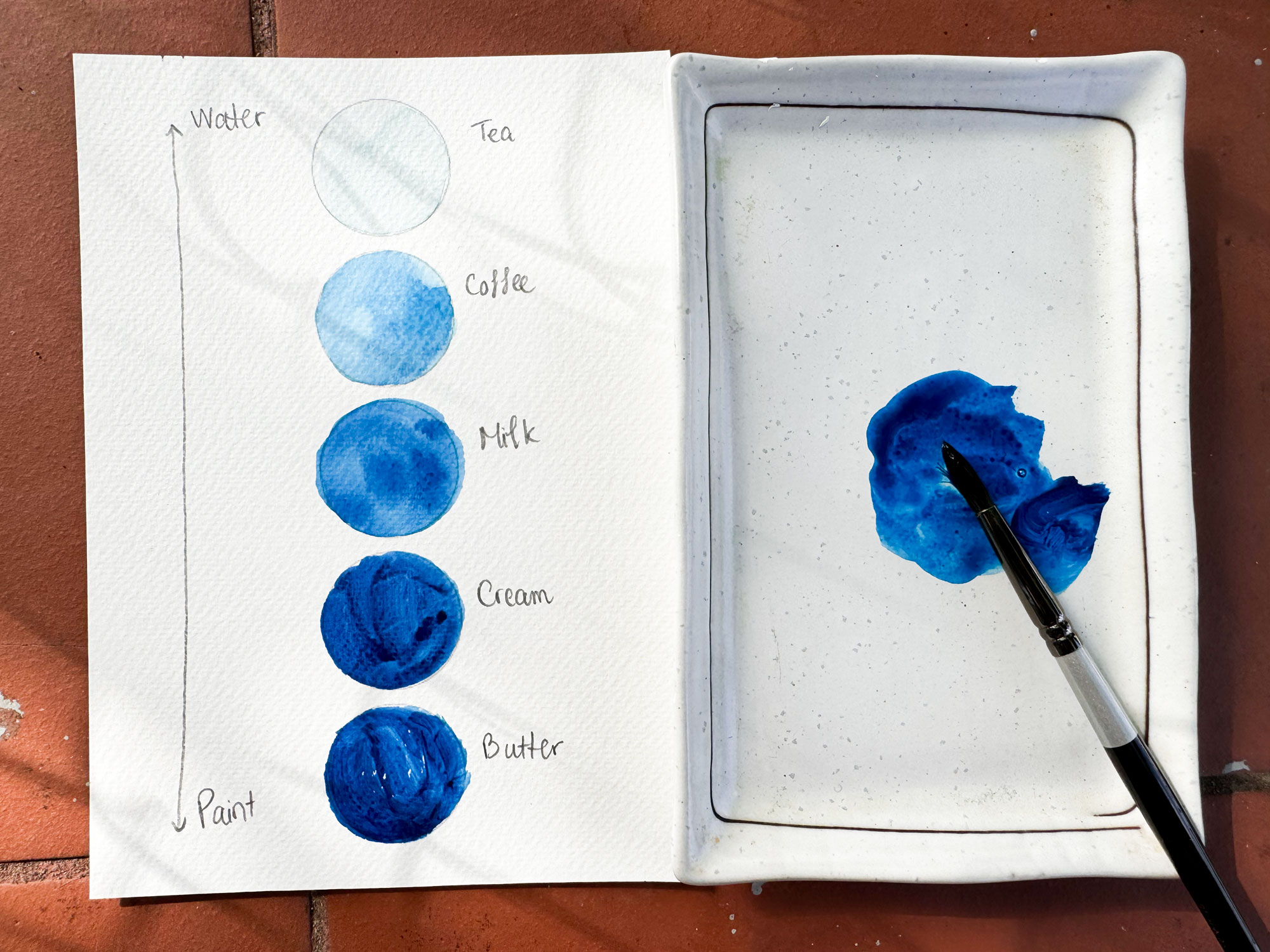
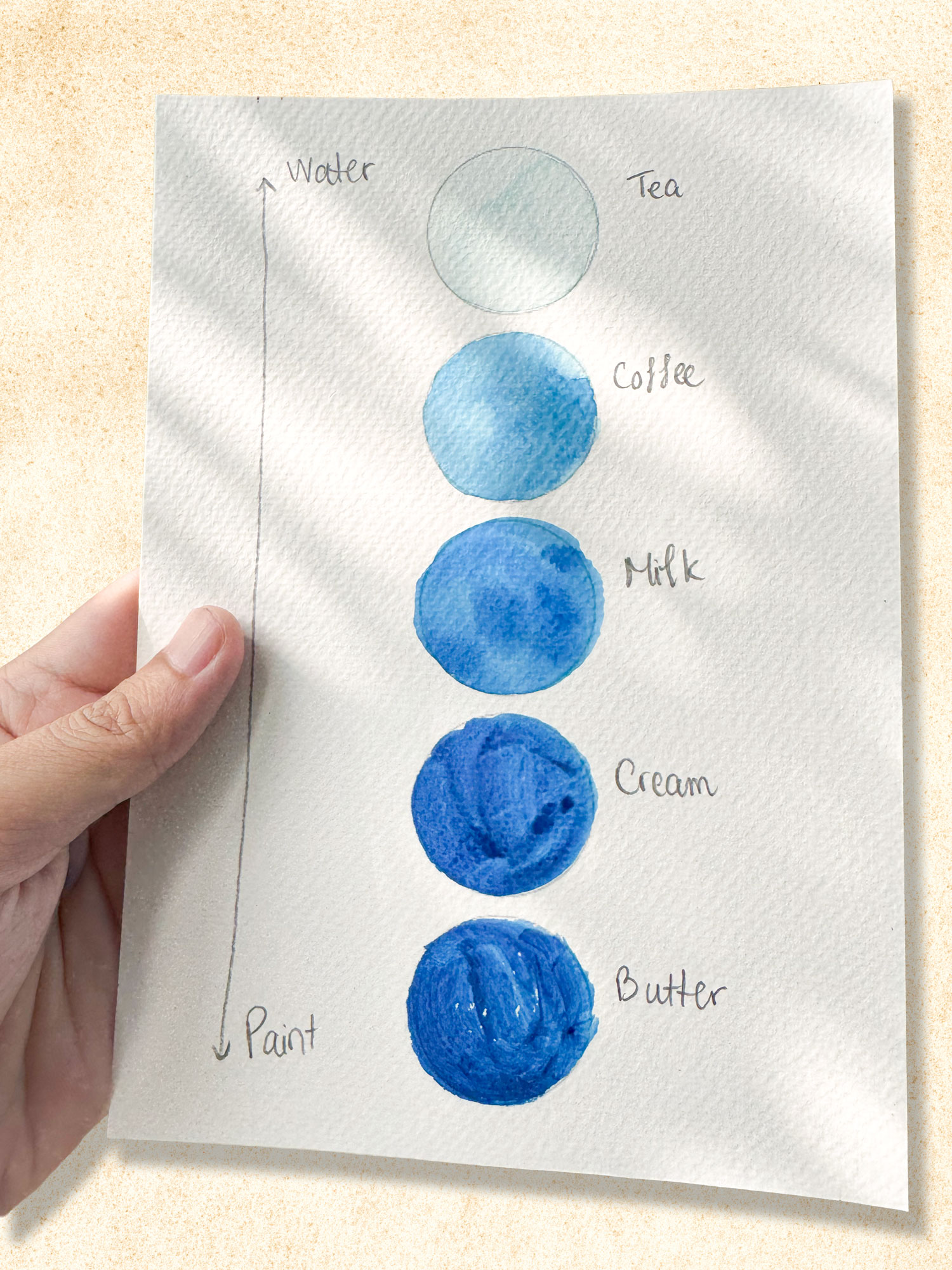
How much water you need depends on how dark you want the color: more water for light color, less water for dark color. Think of the tea – coffee – milk – cream – butter scale: “tea” is about 90% water for skies and first layers, while “cream” and “butter” are mostly paint for details and deep shadows. The quickest check is the shine: if your paper or brush looks very glossy, there’s too much water; if it looks dull and dry, there’s too little.
What Is the Water-to-Paint Ratio (and Why Does It Matter)?
The water-to-paint ratio is simply how much water you mix with your paint. It decides whether a color is light or dark, transparent or rich, and how it spreads on the paper. In watercolor, you don’t lighten colors with white paint – the light comes from the water and the white paper underneath. Want a lighter color? Add water.
| Consistency | Approx. ratio | What it looks like | Use it for |
|---|---|---|---|
| Tea | ~90% water | Very pale, transparent, runs when you tilt the palette | Skies, first layers |
| Coffee | ~70% water | Light-medium, still transparent | Water, distant areas |
| Milk | ~50% water | Clear color, flows slowly | Most of your painting |
| Cream | ~30% water | Rich and thick, less transparent | Foreground, shadows |
| Butter | ~10% water | Almost pure paint | Small accents, darkest details |
How Much Water to Use in Watercolor: 4 Simple Steps
10-minute exercise: Print the free practice sheet, use one color per row, and paint each box from “tea” to “butter.” Let it dry and compare – it becomes a reference chart you’ll use again and again.
Common Mistakes (and Quick Fixes)
The most common thing I see in beginners is water control: sometimes too much, sometimes too little – on the brush and on the paper. Here’s what that usually looks like:
The good news? Your feel for water comes quickly – the more you paint, the more natural it becomes.
Tools I Use
My watercolor brush set – I use a size 10 for backgrounds and a size 16 for big areas. The pointed tips hold water well, so it’s easy to control how much paint you lay down. See it on Amazon.
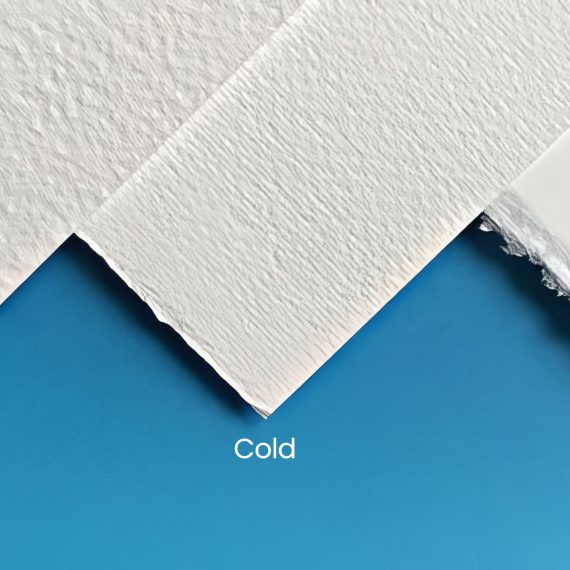
BAOHONG Academy 300gsm Cold Press (100% Cotton) – cotton paper stays damp longer, giving you extra time to fix things when you’ve used too much water. See it on Amazon.
Free consistency practice sheet [LINK DRIVE] – print it on Letter or A4 and paint it on watercolor paper.
👉 Just starting out? See The Only 6 Supplies You Need to Start Watercolor.
Try It on a Painting
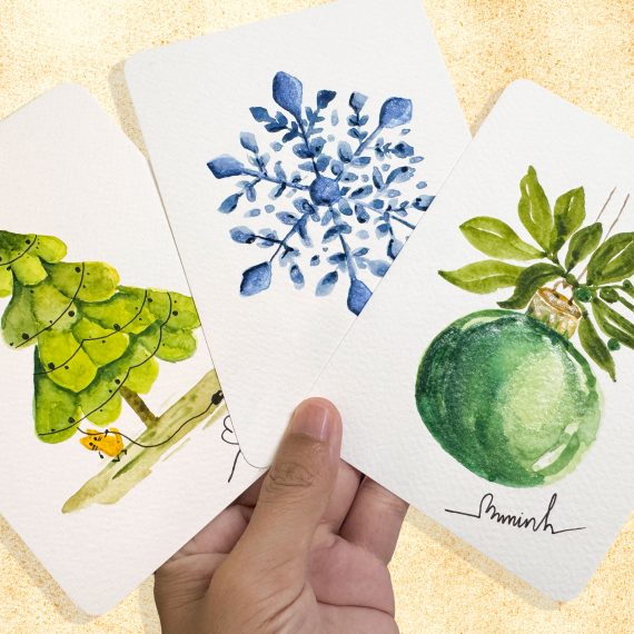
Download the Easy Watercolor Christmas Tree: A Cute 5-Minute Postcard sketch and try three consistencies: “tea” for the background, “milk” for the tree, and “cream” for the shadows. Want more practice? Check out the Easy Watercolor Practice Playlist.
Almost every day, I share an easy watercolor painting – plus sketches you can print and paint right away. Come say hi and show me the first postcard you print!
Follow on FacebookFAQ
There’s no single ratio – it changes with how dark you want the color. A pale “tea” mix is about 90% water and 10% paint, while a thick “butter” mix is almost the opposite. Most of a painting uses “milk,” roughly half water and half paint.
Look at the shine. If the paper looks glossy, water pools into puddles, or your brush is about to drip, there’s too much. A thin, even sheen is just right; a dull, dry look means too little.
Usually there’s too much water in the mix, and watercolor always dries lighter than it looks wet. Mix a little darker than you think you need, especially for shadows, and test on scrap paper and let it dry before painting.
The same or drier. If your brush is wetter than an area that’s starting to dry, the water pushes the paint out and leaves a cauliflower bloom. Once the paper loses its shine, wait until it’s fully dry before adding the next layer.
Yes, it helps a lot. Use one jar for rinsing your brush and one that stays clean for mixing and wetting the paper. Clean water keeps your colors bright and fresh instead of dull and muddy.


No Comments