Every season carries its own color mood, and autumn is the season of transition — between warm and cool, vivid and muted. In this Idea Color Palette series, BMinh uses color-analysis tools together with AI to decode palettes from one of autumn’s most familiar subjects: pumpkins. Four pumpkins with different skins produced four entirely distinct watercolor palettes — from a mysterious navy, to a burst of vibrant orange, to a calm, garden-fresh green. This is the idea-gathering step before the brush ever touches paper, helping watercolor artists picture the mood and dominant tones of their next piece.
Four Palettes, Four Stories
Palette 1 — Navy & Golden Afternoon
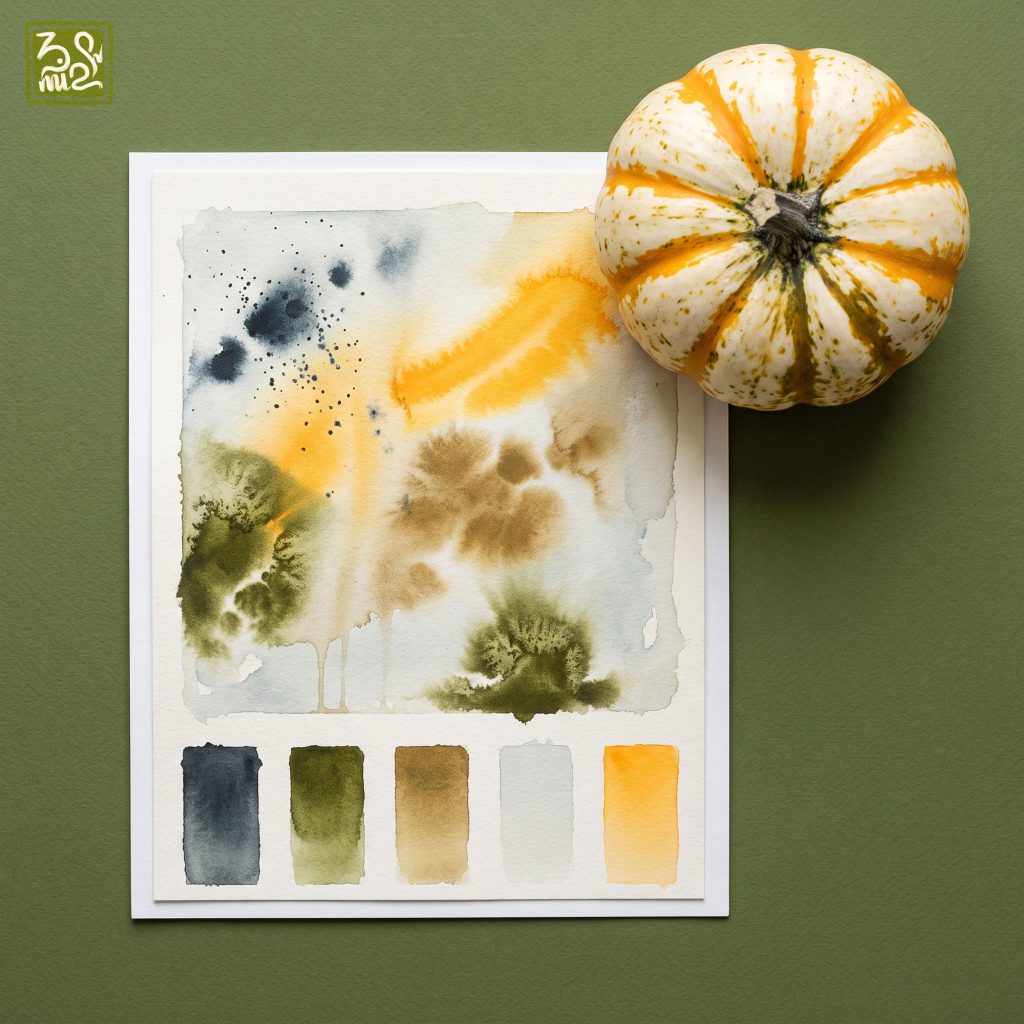
The first palette draws from a white pumpkin striped in vivid orange. Navy washes bloom across the paper alongside a scatter of tiny ink specks, evoking a quiet autumn night, while a streak of golden orange cuts through like the last light of afternoon. Muted olive and earthy brown deepen the composition, and a soft gray keeps it from feeling too loud. A gentle contrast between warm and cool, for anyone who loves balance.
Palette 2 — Vintage Nostalgia
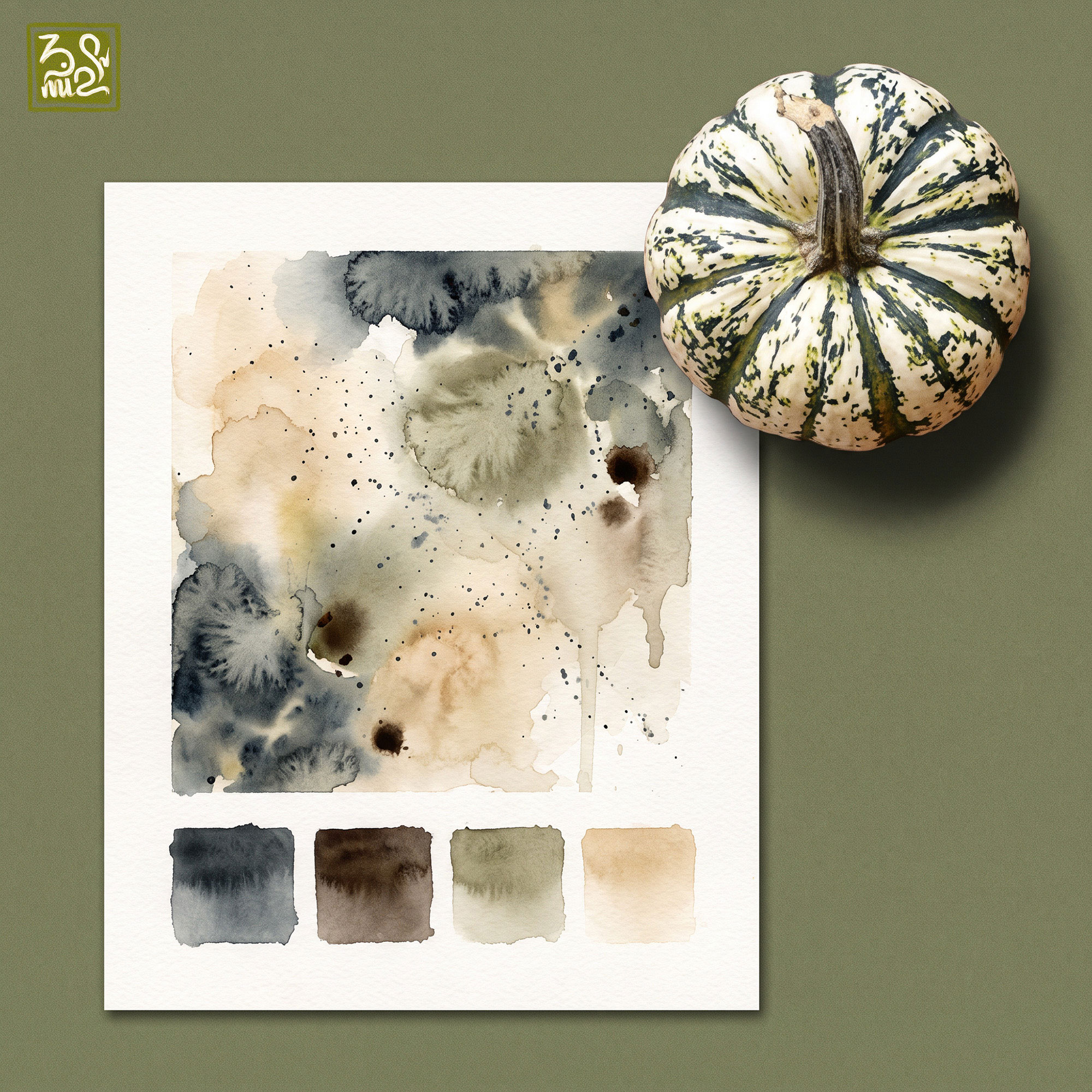
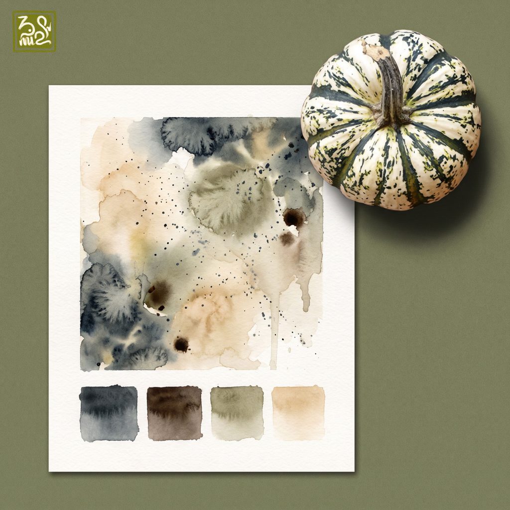
The second palette comes from a white pumpkin marked with deep mossy green stripes, and it leans darker and more mysterious. Wet navy washes bleed into a burnt coffee brown, creating the look of aged paper, dotted with tiny black ink specks like grains of time. A soft sage gray and warm sandy beige balance the darker tones, making the palette feel both vintage and modern — perfect for a nostalgic autumn mood.
Palette 3 — Vivid Energy
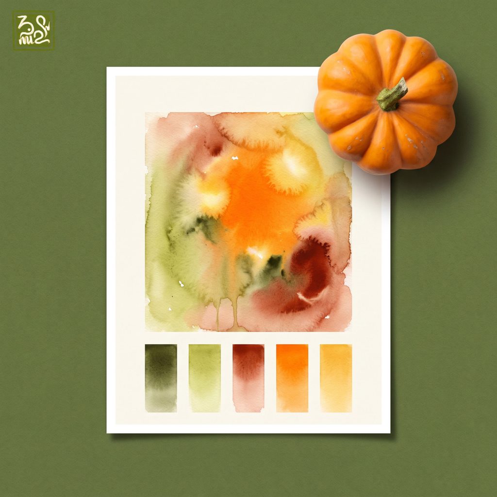
The third palette bursts with energy, inspired by a classic round orange pumpkin. A vivid burnt-orange center is surrounded by deep plum red and mossy olive that tone down the intensity, while honey yellow glows at the edges like late-fall sunlight, and a touch of pale green adds freshness. It’s the liveliest palette in the collection, ideal for autumn still-life paintings or cozy, energetic decor.
Palette 4 — Cool Garden Green
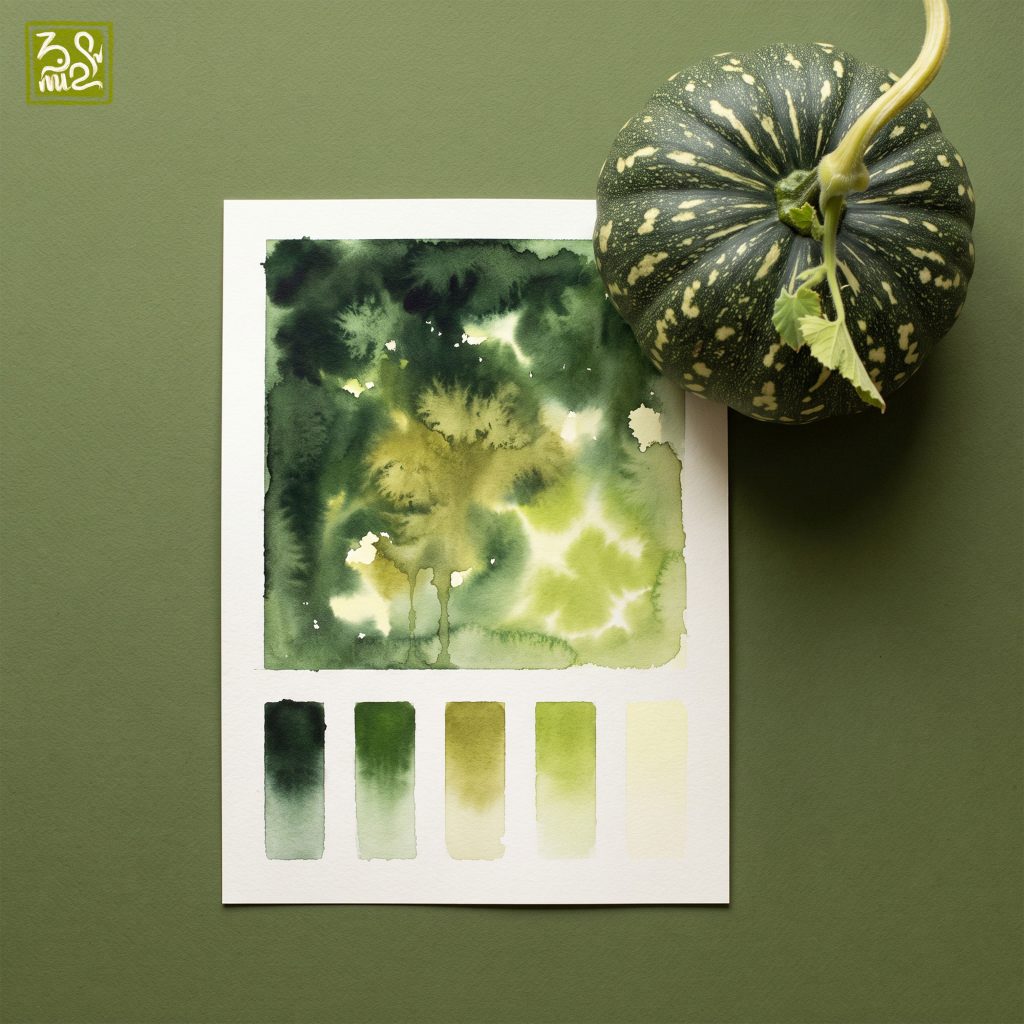
The final palette is drawn from a dark green pumpkin speckled with cream and yellow, carrying the feel of a late-summer garden. Shades of green layer on top of one another, from near-black to golden olive to pale lime, mimicking dappled light filtering through leaves. With no warm tones breaking in, the whole palette feels calm and cool. Ideal for projects that call for a natural, fresh, balanced mood.
Let's Paint and Share Together
Which mood speaks to you the most? If you love watercolor and want to explore more palettes, wet-on-wet techniques, and share your own work, join the BMinh Watercolor Painting Group today. It’s a space to learn, exchange ideas, and spread the love for watercolor together — one palette at a time. Who knows, the next palette in this series might just be inspired by your own painting!






No Comments