Color Palette Collection: Watercolor Inspiration from 4 Purple Flowers
Purple has always lived somewhere between warm and cool. It can be as calm as a lavender field at dusk, or as bold as a cosmos opening in full sun. In this collection, I studied four purple flowers: lavender, crocus, cosmos and hydrangea. I used color-analysis tools and AI to find the main tones of each flower before painting, then turned each one into a watercolor palette.
Palette 1 – Lavender Mist
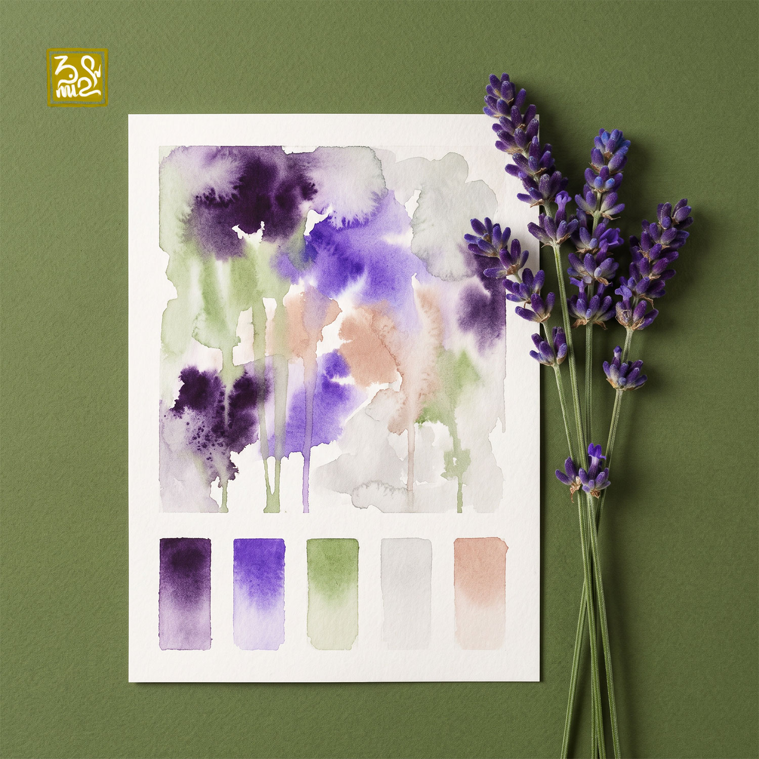
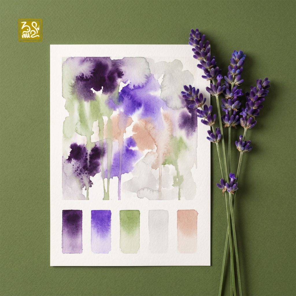
Inspired by fresh lavender stems
This palette feels like walking through a lavender field on a soft morning. Deep plum and violet blooms melt into sage green, which drips down like stems. Misty warm gray and a gentle peach blush keep the purples from feeling too heavy. The result is calm, airy and a little romantic.
Palette 2 – Saffron Glow
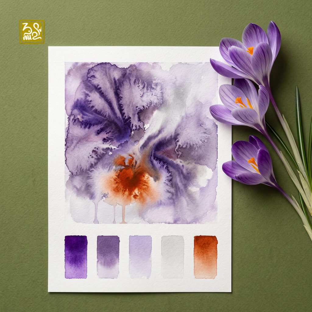
Inspired by the purple crocus and its fiery orange stamens
Crocus petals have fine veins and soft layers, and wet-in-wet blooms capture them well. Royal purple and dusty mauve spread out like opening petals. At the center, a single burst of burnt orange glows like the saffron threads inside the flower. Pale lilac and soft gray fill the rest of the page. One small warm note brings the whole palette to life.
Palette 3 – Midnight Cosmos
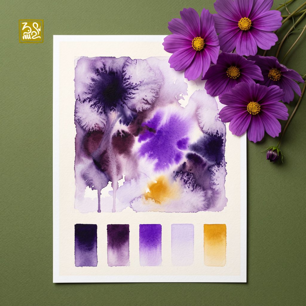
Inspired by deep purple cosmos flowers
This is the most dramatic palette in the collection. Near-black indigo and deep wine purple form the base, and bursts of rich violet break through like petals in the dark. A touch of golden ochre, taken from the flower’s yellow center, glows quietly like a small light. Very pale lilac gives the eye a place to rest.
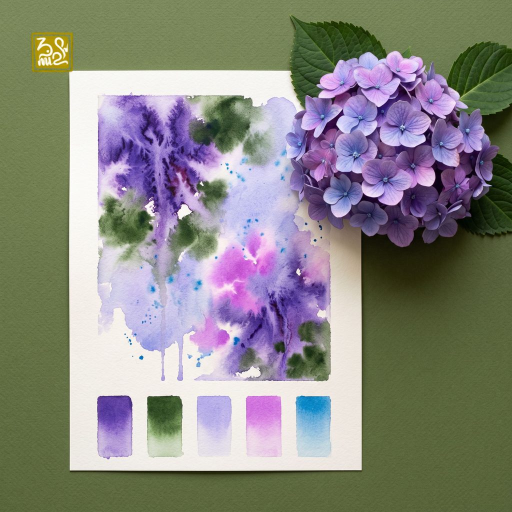
Palette 4 – Hydrangea Garden
Inspired by a purple-pink hydrangea with deep green leaves
Hydrangeas are never just one color. Blue-violet, soft periwinkle and bright orchid pink blend into each other the way hydrangea petals shift from flower to flower. Deep forest green comes from the large leaves and grounds the painting. Small splashes of cerulean blue add sparkle and freshness. It is the most colorful and playful palette of the four, like a garden right after the rain.
Painting with Purple
Let purple lead. Keep most of the painting in purples and lilacs, then add one accent color.
Use complementary accents with care. Orange and yellow make purple glow, but too much turns the mix muddy.
Leave white paper. Pale areas give deep purples room to breathe.
Mix your own purples. Try ultramarine with quinacridone rose for a clean violet, and add a little burnt sienna to calm it down.
Which palette speaks to you most?
Join the BMinh Watercolor Painting Group on Facebook to try these palettes, share your paintings and connect with fellow watercolor lovers.






No Comments