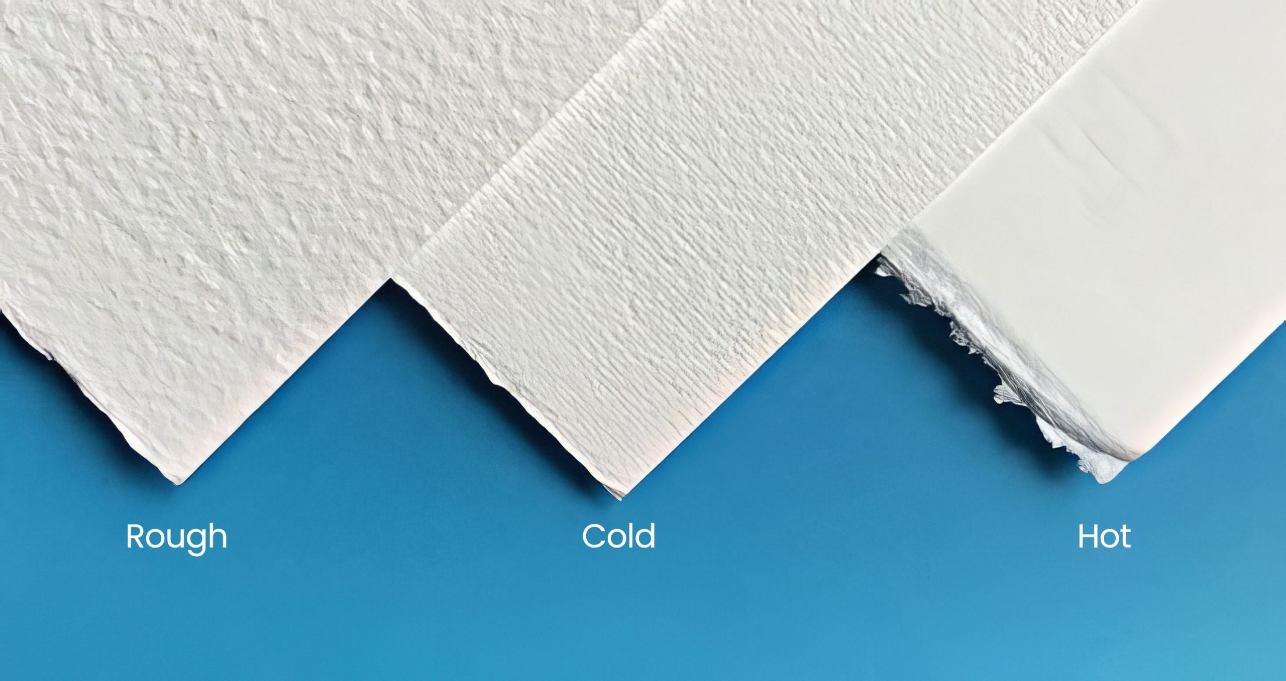
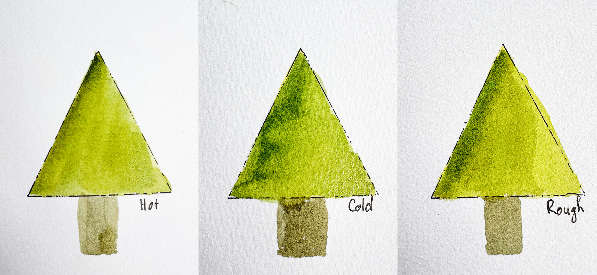
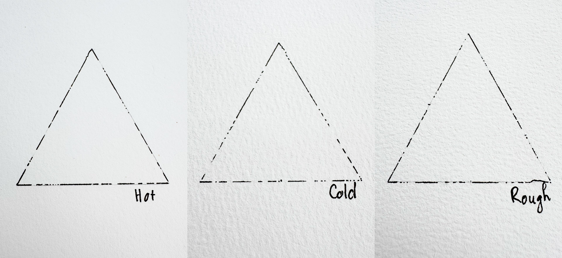
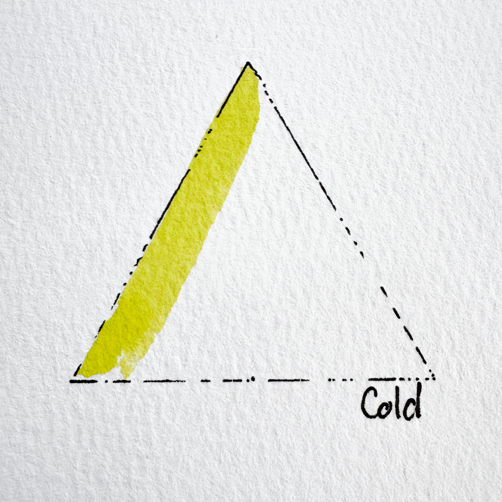
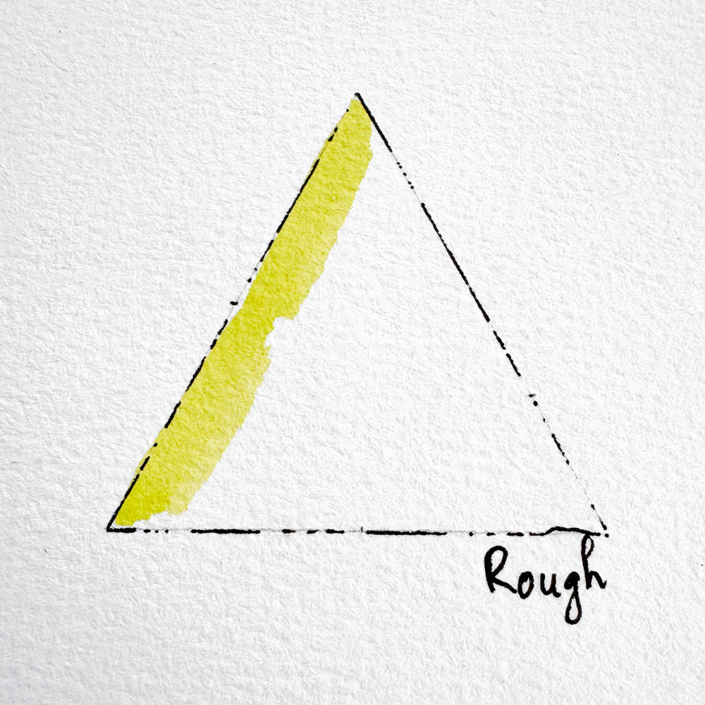
Watercolor paper comes in three main textures: hot press, cold press and rough. Hot press vs cold press watercolor paper sounds like a technical question, but it really comes down to one thing: how your paint behaves the moment it touches the paper. I painted the same little tree on smooth, medium and rough paper so you can see the difference before you spend a cent.
By the end, you’ll know which texture to pick for your first postcard, and why the right paper makes your washes look smoother even if you’ve only just picked up a brush.
Best for: beginners choosing their first paper · Reading time: 6 min
This post contains affiliate links. As an Amazon Associate I earn from qualifying purchases.
Quick answer: which paper should you choose?
In the hot press vs cold press watercolor paper debate, beginners should start with 100% cotton cold press paper, 300gsm (140 lb). It forgives uneven washes, holds water long enough for soft blends, and works for almost every project on this blog.
The three watercolor paper textures at a glance
Texture
Feels like
Best for
Watch out for
Hot press
Smooth, like card stock
Fine details, lettering, ink and wash, scanning
Dries fast; shows streaks and backruns
Cold press
Light, even bumps
Almost everything; beginners
Very fine lines can look slightly broken
Rough
Deep, pebbly
Loose landscapes, sparkling water
Small details and lettering
Why texture changes how your paint behaves
Paper texture (artists call it “tooth”) comes from how the sheet is pressed. Hot press paper goes through heated rollers, so the surface is almost flat. Cold press (labeled NOT in the UK) is pressed without heat and keeps small bumps. Rough paper is barely pressed at all, so it has the deepest texture. On the package, look for HP (hot press), CP or NOT (cold press) and R (rough).
On textured paper, pigment settles into the tiny valleys between the bumps. That is why the same color looks softer and a little grainy on cold press and rough, but flatter and brighter on hot press.
Hot press: smooth and precise
Hot press is the favorite of botanical artists, letterers and anyone who loves ink and wash. Lines stay crisp, colors look bright, and scans come out clean with no paper shadow.
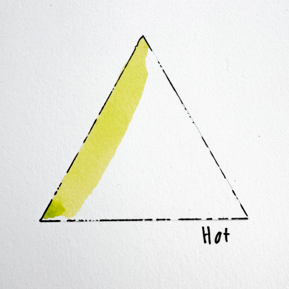
When I painted my tree on hot press, the edges were beautifully clean, but the background wash dried into hard lines before I could finish it.
Cold press: the forgiving middle
Cold press is what I use for almost every postcard you see on this blog: BAOHONG Academy cold press, 300gsm, 100% cotton. The little bumps hide small wobbles in my washes, and the paint stays wet long enough for me to blend.
If you only buy one paper, make it cold press. It’s also the paper I design all my printable sketches for. See it on Amazon
Rough: bold and textured
Rough paper shines in loose landscapes. When you drag a fairly dry brush across it, paint catches only the tops of the bumps and leaves tiny white specks, perfect for sparkling water or snow.
Texture isn’t everything: cotton vs cellulose
What the paper is made of matters as much as its texture. 100% cotton paper soaks up water and stays damp longer, so colors blend smoothly and you can layer or lift paint to fix mistakes. Cellulose (wood pulp) paper dries faster and streaks more easily, but it is cheaper and fine for practice.
Paper weight: why 300gsm (140 lb) is the sweet spot
Thinner paper (like 190gsm, 90 lb) buckles quickly under lots of water. 300gsm is thick enough for beginner washes without the price of heavier sheets. If yours still curls, here’s how to keep it flat: [LINK: Why Your Watercolor Paper Buckles – scheduled 30/10].
My simple paper test (try it yourself)
Cut a small piece from each paper you own and do three things: paint a flat square of color, paint a gradient from dark to light, and add a few tiny details. Let everything dry, then put the pieces side by side. The paper that gives you the smoothest square without rushing is the one for you.
Want something quick to test your paper on? Try my Easy Watercolor Practice Playlist: short videos made for beginners, just a few minutes each.
So which texture should you choose?
Your first paper, or you're not sure yet: cold press.
You love fine detail, lettering, or scanning your art for prints: hot press.
You love loose, textured landscapes: rough.
For most beginners comparing hot press vs cold press watercolor paper, I usually recommend cold press because it gives you more time and hides small mistakes.
Your first painting on cold press
Got your paper? Start with a 5-minute little tree in Easy Watercolor Christmas Tree: a free printable sketch sized for a postcard.
Which paper are you using? Share your painting or ask a question in our watercolor community group on Facebook and chat with hundreds of other members.
Cold press is better for most beginners. Its texture holds water longer and hides uneven washes, so your first paintings look smoother. Hot press is a better fit once you control water well and want fine detail.
Smooth paper dries fast and the paint sits on top instead of sinking in. Dampen the paper first, use a bigger brush, work quickly, and tilt the sheet slightly so the paint flows evenly.
Most good papers can be painted on both sides. If there’s a watermark, the side where it reads correctly is usually the front, and its texture is often slightly nicer.




No Comments